
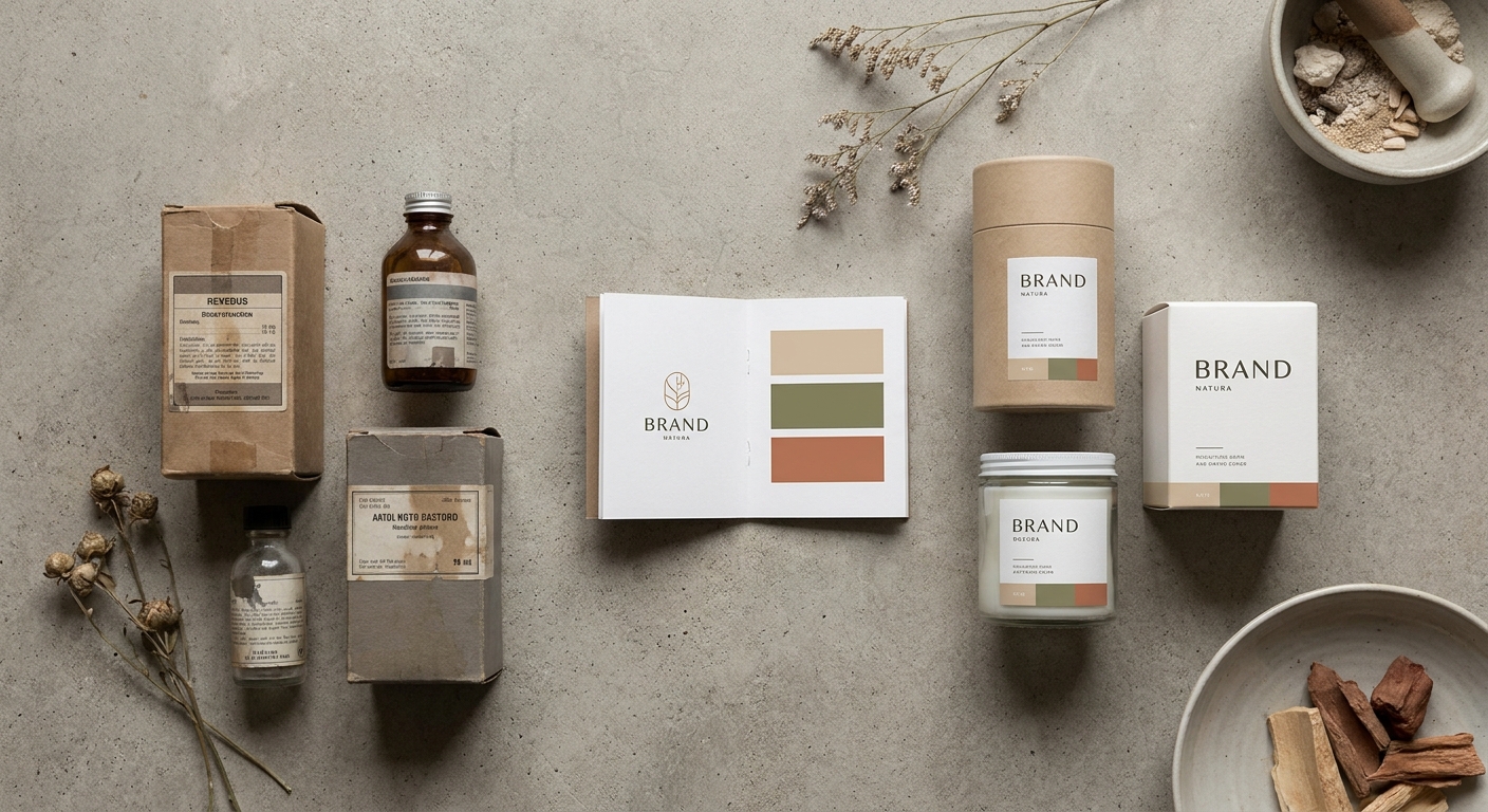
TL;DR: The most instructive brand refresh case studies in packaging and visual identity share four traits: a positioning decision that preceded every design choice, packaging architecture built for both physical shelf and digital scroll, a visual system that travels across paid media without losing coherence, and a measurable outcome tied to revenue — not just design awards. This guide breaks down what those refreshes actually looked like, what criteria separated the wins from the restarts, and what a DTC or CPG brand should demand from a growth partner before committing to a refresh in 2026.
Why brand refresh case studies in packaging and visual identity matter right now
Shopper attention at shelf lasts under 3 seconds. On a paid social feed in 2026, a creative unit has roughly 1.5 seconds to stop the scroll. Packaging is the ad unit for most CPG and DTC brands — it appears in unboxing content, in flat-lay creative, in product photography across every paid channel. A visual identity that was built for a 2019 retail shelf will actively suppress CTR on Meta and TikTok today.
The brands that get brand refresh case studies written about them are not the ones that went prettier. They are the ones that went clearer — clearer claim, clearer hierarchy, clearer tie to who the buyer actually is.
Who this is for
This guide is for founders and senior marketers at advanced-stage consumer brands — typically $5M–$100M in annual revenue — who are sitting on a visual identity that no longer reflects the brand's current positioning, price point, or customer. You are not starting from zero. You have existing equity, existing customers, and a paid media program that depends on creative consistency. A refresh that ignores any of those three inputs is not a refresh — it is a rebrand disguised as one, and it carries full rebrand risk.
What to look for in a brand refresh case study: packaging and visual identity
Strategic intent preceding design decisions
Every high-performing brand refresh starts with a positioning document, not a mood board. In the strongest case studies from 2026, the creative brief answered three questions before a single asset was produced: who is the primary buyer now (not at launch), what is the single functional or emotional claim the packaging must land, and what is the brand doing at retail versus DTC versus paid social? Packaging designed without those answers produces beautiful work that performs poorly in market.
Packaging architecture built for multiple surfaces
A 2026 consumer brand needs packaging that works at 12 inches on a physical shelf, at 80×80 pixels as a product thumbnail, and as a prop in a 9:16 vertical video. The best refresh case studies show explicit decisions about hierarchy — which element is primary (brand mark, claim, color block, icon) and how that element is preserved across every surface. Brands that treat packaging as a static print exercise miss the DTC performance dimension entirely.
Visual system coherence across paid channels
The packaging refresh is only successful if it generates a usable creative system. That means the color palette, typography, and graphic language translate directly into paid social assets, email headers, and landing page design. In strong case studies, the agency delivering the refresh also stress-tests new assets in paid media within 30–60 days of launch, using creative performance data to confirm the visual identity is driving click behavior — not just shelf presence.
Measurable outcomes with revenue or conversion data
Design metrics — impressions of a rebrand announcement, social engagement on a packaging reveal — are vanity metrics for a growth brand. The case studies worth studying cite concrete numbers: sell-through rate change at retail, CPM efficiency on new creative versus old, conversion rate delta on product pages after updated photography went live, or revenue per unit change driven by a perceived premium shift. Apex Brands partners cite over $1.5 billion in revenue generated across 152+ brand partnerships — that number exists because outcomes are tracked, not because the work looked good.
Transition management to protect existing customers
A refresh that confuses current buyers costs more than a stagnant identity. The brands that execute this well run the transition with overlapping SKU presence, communicate the change to existing customers in advance, and preserve one or two high-equity visual cues — a color, an icon, a typographic style — so that loyal buyers recognize the product mid-refresh. The case studies that omit this phase tend to show a dip in repeat purchase rate in the 60–90 day window post-launch.
Paid media creative alignment from day one
A refresh that hands off finished brand guidelines to a separate paid media team and hopes for alignment is a recipe for creative fragmentation. In 2026, the strongest brand refresh case studies show integrated workflows: the team building the visual identity is the same team — or a direct partner of the team — running the paid media program. This closes the gap between brand equity built at awareness and purchase intent captured at conversion. See how to develop packaging creative that supports brand positioning for the tactical framework behind that alignment.
What strong brand refresh case studies actually show: a pattern analysis
Across the category in 2026, the brand refresh case studies that demonstrate real commercial outcomes share a consistent pattern:
- Positioning shift first. The visual identity changed because the brand's market position changed — not the other way around. A premium price increase preceded the packaging redesign by at least one quarter in most winning examples.
- Color as a strategic weapon. Brands that own a distinctive color in their category outperform on shelf recognition. The refreshes that gained ground chose a color block that was either unoccupied in the category or meaningfully differentiated from the incumbent brand.
- Typography simplified, not decorated. Every winning refresh in the DTC and CPG space moved toward fewer typefaces (typically two), higher contrast, and bolder primary hierarchy. The ones that added typographic complexity to signal "premiumness" saw CTR decline on paid social.
- Photography system updated in lockstep. Brands that refreshed packaging but kept pre-refresh product photography on their DTC site created a dissonant experience. The conversion lift from a packaging refresh is only fully captured when the full visual system — on-pack, on-site, in-ad — updates together.
- Retail and DTC treated as distinct surfaces. The packaging hierarchy that works for a Target shelf (read from 18 inches, category shopper scanning 20 SKUs) is not the same as the hierarchy that works for a Meta carousel (single hero image, 1 second of attention, brand already known from prior touchpoints). Winning case studies show explicit adaptation, not one-size-fits-all files.
The DTC brand rebranding case study on category repositioning covers the mechanics of that surface-specific adaptation in depth.
What to avoid
Refreshing before the positioning is locked. If the leadership team cannot agree on one sentence that describes who the brand is for and why it wins, no visual identity update will fix that. Packaging design will paper over a strategic disagreement and the next refresh will be needed within 18 months.
Treating packaging and digital creative as separate workstreams. Agencies that hand off brand guidelines to a production vendor without maintaining creative oversight produce assets that are technically on-brand but commercially inert. The paid media creative that runs after a refresh determines whether the investment pays back — that work cannot be delegated to a team that was not in the room for the positioning decisions.
Optimizing for industry awards over customer behavior. The packaging that wins a design award is often the packaging that is most distinctive to designers — minimal, considered, art-directed. The packaging that drives conversion at retail and in paid social is often plainer, bolder, and more explicit about the claim. These are not always the same thing. Measure sell-through and CTR, not trophy counts.
Verdict comparison: what separates winning refreshes from expensive ones
| Criteria | Winning refresh | Expensive restart |
|---|---|---|
| Positioning document | Complete before design begins | Written after the first design round |
| Paid media stress-test | Within 60 days of launch | Never, or 6+ months later |
| Transition management | Overlapping SKU + customer comms | Hard cutover, no communication |
| Photography system | Updated in lockstep with packaging | Updated 6–12 months post-launch |
| Revenue outcome tracked | Yes, with specific metrics | No, "brand equity" cited instead |
| Channel adaptation | Explicit retail vs. DTC vs. paid | Single master file, resized |
One last thing
The most common mistake brands make in a packaging refresh is asking the design team to make the product "look more premium" without changing the price, the positioning, or the channel strategy. Premium visual signals only convert to revenue when the buyer already has a reason to pay more. The packaging communicates the reason; the strategy creates it. In every successful brand refresh case study, the design work was the last decision made — not the first. Explore the Apex Brands case study library to see how that sequence plays out in practice across CPG and DTC categories.
Questions we are
often asked.
The questions founders ask most often about this topic — answered straight.
Ask a question →01What is a brand refresh in packaging and visual identity?
02How long does a packaging and visual identity refresh take in 2026?
03What does a brand refresh case study in packaging typically measure?
04When should a DTC brand consider a packaging refresh versus a full rebrand?
05Can a packaging refresh hurt an existing customer base?
06How does packaging visual identity affect paid media performance?
07What should a brief to a creative agency include for a packaging refresh?
08How does Apex Brands approach brand refresh work for DTC clients?
We work with a small number of brands each year.
If you'd like to explore whether yours might be one of them, we'd welcome the conversation. There is no deck, no SDR, and no obligation on either side.