
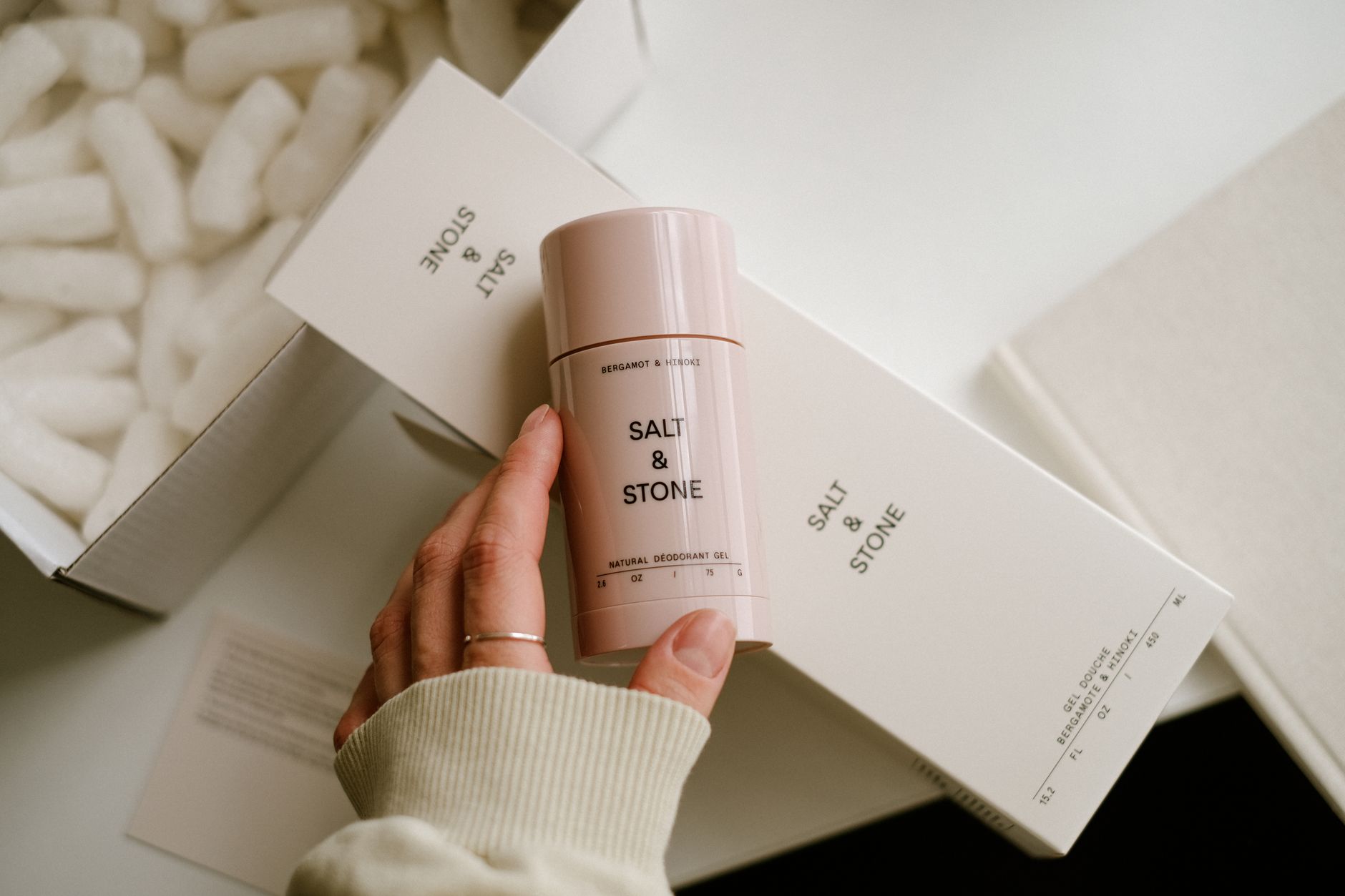
TL;DR: Building a visual identity for a DTC product brand in 2026 requires six sequential steps: anchoring visuals to brand positioning, defining a color and typography system, designing a logo mark that scales to a 32px favicon, building a photography style guide, codifying the full system in a brand bible, and stress-testing every asset across paid social, packaging, and email. Skip the positioning step and every downstream visual decision is a guess.
Why this matters
DTC brands live or die on first impressions delivered in a feed, on a shelf image, or in a 2-second ad. In 2026, paid social CPMs on Meta and TikTok continue to climb, which means a recognizable, consistent visual identity directly reduces cost-per-acquisition — buyers trust what they recognize. Inconsistent visuals, by contrast, force every impression to work harder than the last. The six steps below build a system that compounds.
What you'll need
- A completed brand positioning statement (your differentiator, target buyer, and one-line proof)
- Competitor visual audits — screenshots of 5–10 competitors' ads, PDPs, and Instagram grids
- A designer or design tool (Figma works for most DTC teams at this stage)
- A color contrast checker (WCAG AA minimum — 4.5:1 ratio for body text)
- 4–6 hours of structured stakeholder alignment time across the process
- A brand bible template — Google Slides or Notion both work
If brand positioning isn't locked before you open Figma, stop and build a brand positioning strategy for DTC first. Visuals built on vague positioning get redesigned within 18 months.
The steps
Step 1: Translate brand positioning into visual territory
What it accomplishes: Converts the words in your positioning statement into a visual direction before a single pixel is placed.
Why it matters: Every color, typeface, and image style carries emotional signal. A supplements brand positioned on clinical efficacy and one positioned on community wellness can sell identical products — but their visual territories should look nothing alike. Conflating the two is the most common DTC visual identity mistake in 2026.
How to do it: Pull your brand positioning statement. Extract 3 adjectives that describe the brand's personality (not the product — the brand). Map each adjective to a visual dimension: energy level (bold vs. restrained), temperature (warm vs. cool palette), texture (minimal vs. layered). Then audit your 5–10 competitor screenshots and identify the visual clichés in your category. Your territory lives where your positioning adjectives are true and the category clichés are absent.
Common mistake: Choosing visual territory based on what founders personally like rather than what the target buyer responds to. Run a 5-person customer interview with mood boards before committing.
Step 2: Define your color system
What it accomplishes: Establishes 1 primary brand color, 1–2 secondary colors, and 2 neutrals with defined usage rules.
Why it matters: Color is the fastest-recognizing brand signal — faster than logo, faster than typeface. Consistent color use across 10 ad impressions builds recognition that cuts through feed fatigue. A DTC brand with no color discipline looks like a different company every week.
Specific instructions: Pick a primary color first. Test it at 100% saturation, 60%, and 20% — you need all three to work for backgrounds, CTAs, and accents. Define hex codes, not just names. Add one warm and one cool neutral. Check every combination at 4.5:1 contrast ratio minimum. Document the rule: primary color appears on every asset; secondary colors rotate by campaign; neutrals anchor body copy and white space.
Expected outcome: A 6-color swatch with contrast ratios documented, ready to hand to any designer or ad platform.
Common mistake: Selecting colors that look good in isolation but bleed into each other on mobile screens. Test on an actual phone before locking.
Step 3: Select and pair typography
What it accomplishes: Locks one display typeface and one body typeface that carry personality and maintain legibility at every size.
Why it matters: Typography does more brand work than most DTC founders realize. The display face sets the tone in headlines, ads, and packaging. The body face signals whether the brand respects its reader. Mismatched pairings — a playful serif with a cold sans-serif body, for example — send conflicting signals that erode trust subconsciously.
Specific instructions: Start with the display face. It should reflect 1–2 of your positioning adjectives directly. Pair it with a high-legibility sans-serif body face. Test the pairing at 14px, 18px, 24px, and 48px. Both fonts must be available in licensing terms that cover web, social, and print. Document usage rules: display face for headlines and CTAs only; body face for all copy over 2 lines.
Expected outcome: Two licensed typefaces with size and weight specifications.
Common mistake: Using a trending typeface that 12 other brands in your category already use. Pull your competitor audit and eliminate any typeface that appears more than twice.
Step 4: Design the logo mark
What it accomplishes: Creates a primary logo, a wordmark, and a standalone icon that each work independently.
Why it matters: DTC brands need a logo that reads at 32px (browser favicon), at 500px (product packaging), and everywhere in between. A logo that requires color to be legible is broken. A logo that requires a minimum width of 200px will be misused within 60 days of launch.
Specific instructions: Design in black on white first. If it doesn't work in monochrome, it doesn't work. Build three versions: full logo (wordmark + icon together), wordmark only, icon only. The icon must be square-friendly for profile images. Test all three at 32px, 100px, and full bleed. Define a minimum clear space rule — typically 1x the cap height of the wordmark on all four sides.
Expected outcome: Three logo files (SVG + PNG) per version, in full color, reversed (white on dark), and monochrome.
Common mistake: Designing the icon too complex for small sizes. Any detail that disappears below 100px needs to be removed.
Step 5: Build a photography and motion style guide
What it accomplishes: Defines the visual language for product photography, lifestyle imagery, and video that runs across your site, ads, and social — the assets that actually drive DTC conversion.
Why it matters: In 2026, most DTC brands run 20–50 creative variants per month across Meta, TikTok, and email. Without a photography style guide, each batch of creative drifts from the last. Buyers stop recognizing the brand between touchpoints, and retention metrics suffer.
Specific instructions: Define 4 dimensions — lighting (natural vs. studio, hard vs. soft), background (white, textured, lifestyle scene), subject framing (tight product detail, 3/4 product, lifestyle in-use), and color grading (warm, cool, neutral). Produce 3 reference images per dimension showing "on-brand" and 2 "off-brand" examples. For motion, define pace (cut frequency), music temperature (upbeat, calm, tense), and whether the brand uses text overlays or voiceover as primary.
Expected outcome: A one-page visual reference sheet designers and photographers use as a brief, not a suggestion.
Common mistake: Defining style in words only. "Warm and approachable" means something different to every photographer. Reference images are non-negotiable.
Step 6: Codify everything in a brand bible and stress-test it
What it accomplishes: Packages all five prior steps into a single living document, then tests it against real formats before launch.
Why it matters: A visual identity that lives in a founder's head or a single designer's Figma file gets corrupted the moment a second person touches it. By the time a DTC brand is running paid social, email, influencer content, and packaging simultaneously, 6–10 people are making visual decisions daily. The brand bible is the constraint that keeps them aligned without requiring a design review on every asset.
Specific instructions: Structure the brand bible in this order: brand positioning summary (1 page), color system (swatches + hex codes + contrast ratios), typography (typefaces + size hierarchy + usage rules), logo usage (all versions + clear space + misuse examples), photography and motion style (reference images), and channel-specific applications (ad formats, email header, packaging, social profile). Test the system against 5 real formats before you call it final: a Meta feed ad at 1:1, a TikTok full-screen at 9:16, a product detail page hero image, a packaging dieline, and an email header. If any of the 5 fail, fix the system — not the individual asset.
Expected outcome: A brand bible under 20 pages, accessible to every team member and vendor, updated quarterly.
Common mistake: Building the brand bible at the end of a project and never opening it again. Schedule a quarterly review date on the day you publish it.
Troubleshooting
The logo looks fine on screen but breaks on packaging. You built it in RGB, not CMYK. Convert all brand colors to Pantone or CMYK equivalents before any physical production. Keep both color profiles in your brand bible.
Paid social creatives look inconsistent even when the team follows the guide. The photography style guide is too abstract. Add 3 explicit "do not" examples — wrong lighting, wrong framing, wrong color grade — alongside the approved reference images.
The visual identity feels generic for the category. Go back to Step 1. The positioning adjectives weren't distinct enough, or the competitor audit wasn't completed. Generic visuals almost always trace back to vague positioning, not execution failure.
Freelancers and agencies keep going off-brand. The brand bible isn't being included in creative briefs. Add a single-page "visual quick reference" — color codes, typefaces, one approved photo example — that lives at the top of every brief you send. Apex Brands builds this into every creative brief template for DTC clients.
The color system fails on dark mode email clients. Test primary and secondary colors on both white (#FFFFFF) and near-black (#1A1A1A) backgrounds before locking. Add dark-mode color values to the brand bible explicitly.
The brand identity looks dated 18 months after launch. The visual territory was defined against 2024 competitors, not 2026 ones. Audit the category annually and adjust photography style and type weight — core colors and logo should remain stable, but peripheral elements evolve.
Tools and resources
- Figma — brand bible templates, logo design, style guide documentation
- Adobe Color — palette exploration and contrast ratio checking
- Coolors — rapid color system iteration
- Google Fonts — licensing-safe typography options
- Canva Brand Kit — useful for distributing approved assets to non-designers
- How to create a brand identity for a DTC product — covers identity from a strategic angle, useful alongside this guide
- How to develop a brand voice for a DTC product — brand voice and visual identity should be built in parallel, not sequentially
What to do next
Once the brand bible is live, the next constraint is getting visual identity to hold across paid media at scale. The breakdown point for most DTC brands isn't the identity system — it's the creative production process that's supposed to follow it. Read the guide on how to scale creative content for DTC paid social to build a production workflow that keeps the identity intact across 30+ monthly ad variants.
One last thing
The most durable visual identities in DTC — brands that maintain recognizability across 5 years of category evolution — share one trait: they were built to be restrictive. The brand bible said no to as many things as it approved. If your style guide doesn't have a "do not" section with real examples, it isn't a guide — it's a mood board.
Questions we are
often asked.
The questions founders ask most often about this topic — answered straight.
Ask a question →01What is a visual identity for a DTC product brand?
02How long does it take to build a DTC brand visual identity?
03How much does visual identity development cost for a DTC brand?
04What's the difference between a brand identity and a visual identity?
05What's the most important element of a DTC visual identity?
06Should a DTC brand refresh its visual identity?
07How do I know if my visual identity is working?
08Does a DTC brand need a brand bible?
We work with a small number of brands each year.
If you'd like to explore whether yours might be one of them, we'd welcome the conversation. There is no deck, no SDR, and no obligation on either side.