
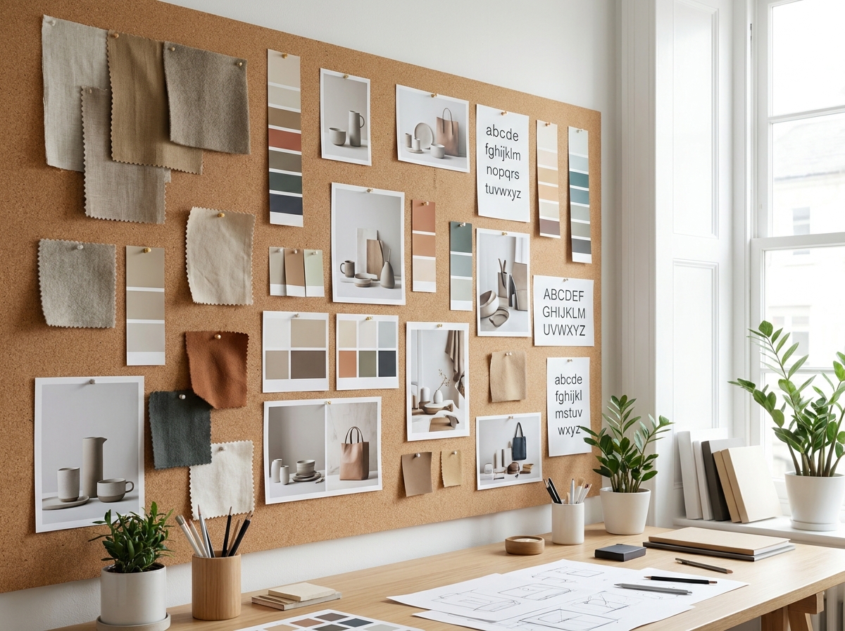
TL;DR: Building a mood board for a campaign concept means collecting visual, tonal, and emotional references that define the campaign's world—colors, typography, photography style, copy voice, and competitive white space. Done right in 2026, a tight mood board cuts revision cycles, speeds creative brief approval, and gives your production team an unambiguous target. This guide covers every step, from source material to final handoff.
Why this matters
Most campaign miscommunications happen before the brief is written—not after. A founding team says "clean and premium" and a designer hears "white background with sans-serif." Those words mean six different things to six different people. A mood board replaces interpretation with evidence. It shows, it doesn't describe. In DTC and e-commerce marketing in 2026, where a single paid social campaign can run across Meta, TikTok, Pinterest, and connected TV simultaneously, alignment at the concept stage is the difference between a cohesive launch and a patchwork of one-offs.
What you'll need
- A defined campaign objective — awareness, acquisition, retention, or relaunch. The mood board looks different for each.
- A creative brief draft — even a rough one. The mood board should illustrate the brief, not replace it. See how to write a creative brief for a campaign for the right starting point.
- Reference-gathering tools — Pinterest boards, Are.na, Milanote, or a shared Google Slides deck. Any of these work; consistency matters more than the platform.
- 30–90 minutes of focused collection time — mood boards built in under 30 minutes tend to be shallow; boards that take more than 90 minutes are usually unfocused.
- At least one stakeholder who can approve direction — someone with veto power needs to sign off before creative production begins.
- Competitive reference material — what your direct competitors ran in the last 12 months, pulled from Meta Ad Library or brand archives.
The steps
Step 1: Lock the campaign territory before touching images
Write three words that describe the emotional territory of the campaign. Not descriptors of the product—descriptors of how the audience should feel when they encounter the creative. "Confident, irreverent, earned" is a territory. "Clean, modern, premium" is noise that every brand on earth claims.
These three words become your filter. Every reference you pull either belongs to that territory or it doesn't. This constraint sounds limiting but saves hours. Teams that skip this step collect 200 images and can't agree on which 20 to keep.
Common mistake: Using brand adjectives from the existing style guide as the territory. The mood board is for a campaign, which may push one edge of the brand harder than usual. The words should describe the specific campaign's energy, not the parent brand's permanent personality.
Step 2: Pull references across four channels, not one
Most mood boards fail because they only pull photography. A campaign runs as video, static ads, copy, landing pages, and out-of-home. Reference each:
- Photography/video direction — lighting quality, subject distance, color temperature, whether the product is hero or lifestyle-embedded
- Typography and layout — editorial weight, serif vs. sans, text hierarchy in a 9:16 frame vs. a square
- Color palette — 3–5 hex values max, not a gradient. Pull from real images, not color theory grids.
- Copy voice — screenshot 5–8 headlines or ad hooks from brands that sound right, even if they're in a different category
Target 6–10 references per channel, then cut to the 3–4 strongest. You'll end the collection phase with 12–16 images/screenshots, not 80.
Expected outcome: A raw folder of 12–20 references organized by channel before any layout work begins.
Step 3: Arrange by tension, not by theme
The most useful mood boards show productive tension—not everything is from the same aesthetic universe. Place a hyper-minimal shot next to a textured, chaotic one. The tension reveals what direction your campaign actually occupies.
In 2026, campaign creative that performs on paid social typically borrows energy from two adjacent worlds, not one. A wellness brand's acquisition campaign might live at the intersection of clinical credibility and raw, unfiltered lifestyle. Show both poles on the board and let stakeholders choose where the campaign lands.
Layout rule: no more than 9 images in a single-slide mood board. Grid or collage format works. If you need to show more, use a second slide for "direction A vs. direction B."
Common mistake: Arranging by color. Color-coordinated mood boards look beautiful and tell creative teams almost nothing about editorial direction.
Step 4: Annotate every reference — briefly
Each image needs a one-line annotation explaining why it's there, not what it is. "Subject is mid-action, never posed — we want this energy" beats "lifestyle photography." Annotations take 10 minutes and eliminate 90% of the ambiguous interpretation that triggers revision rounds.
Annotations also make the mood board reviewable by people who weren't in the room. A creative director at a production partner, a paid media buyer building copy, a founder reviewing a deck at midnight — all of them need to extract the intent without a walkthrough.
Expected outcome: A presentation-ready slide or document where every reference has a 1–2 line rationale a non-designer can act on.
Step 5: Run a 20-minute competitive gap review
Before finalizing the board, pull 5–8 pieces of competitor creative from the last 6 months. The question is not "what are they doing" — it's "what is no one doing that the emotional territory we defined could own."
In DTC and e-commerce marketing in 2026, white space is often tonal, not visual. Competitors in a category may all run warm, aspirational lifestyle content. If your territory words point toward "earned, direct, unsentimental," there's a clear opening. Document that gap in one sentence at the bottom of the mood board.
This single annotation — "no one in this category is running [x]" — is often the most valuable thing on the entire board when pitching the concept internally.
Step 6: Get a single yes/no decision, not a committee review
Present the mood board to one decision-maker first. Give them two options if the territory is genuinely ambiguous: Direction A vs. Direction B, each with its own 6-image grid. Binary choices move faster than open critique sessions.
The decision you're getting is not "do you love every image" — it's "does this world match the campaign we're trying to build." Frame it that way. Once one person approves direction, broader stakeholder review is presentational, not directional.
Common mistake: Sending the mood board as an attachment without context and asking for "thoughts." Feedback without a decision framework produces contradictory notes that take longer to reconcile than building a second board from scratch.
Step 7: Convert the approved board into production constraints
A mood board that doesn't become a production spec is decoration. After approval, extract these hard rules:
- 3–5 approved hex values — not "warm tones," actual codes
- 2–3 approved typefaces or type styles with usage rules (headlines only, body only)
- Lighting and camera direction — one sentence: "natural light, slightly underexposed, no studio flash"
- Subjects/casting direction — age range, physicality, whether talent is looking at camera
- What's explicitly off-limits — one column called "Not this" with 2–3 visual examples
This production spec goes into the creative brief. In 2026, the brief is the legal document; the mood board is the evidence that informed it.
Troubleshooting
The board looks beautiful but nobody agrees on what it means. The territory words from Step 1 were probably too vague. Revisit the three words and make them more specific. "Warm" is not a territory. "Sunburned, post-workout, without the sponsorship logo" is.
Stakeholders are adding references that contradict each other. Run Direction A vs. Direction B instead of combining conflicting aesthetics into one board. Forcing a binary decision surfaces the real disagreement faster than debating individual images.
The mood board looks identical to what competitors are running. Skip Step 5 earlier next time. For now, identify the one element that competitors uniformly include and remove it from your direction — even if it's photographically appealing.
The creative team says they need more references. The board has 16 or fewer references for a reason — more is not more. If the team needs specifics, produce a secondary reference document for a single channel (e.g., a 9-image grid of Meta story formats only), not a larger general board.
The client approved the mood board but the final creative doesn't match it. The mood board wasn't converted into production constraints per Step 7. Without hex codes and explicit direction rules, art directors default to personal preference. Add the production spec layer before the next production briefing.
The campaign ran on 4 channels and each looked like a different brand. The mood board addressed photography but ignored typography and copy voice. Run Steps 2 and 4 across all four reference channels before any single-channel production begins.
Tools and resources
- Milanote — best for annotated boards with team comments attached to individual images
- Pinterest — fast collection, poor for annotation; export to Milanote or Slides before the review stage
- Are.na — better for editorial and cultural reference, weaker for fast DTC campaign work
- Figma — if your design team already lives there, build the board in a dedicated Figma page; annotations become design specs immediately
- Meta Ad Library — the fastest way to pull 6 months of competitor creative for the gap review in Step 5
- For the broader creative strategy that the mood board supports, how to develop a creative marketing campaign strategy covers the upstream positioning work.
- Once creative is approved and production begins, how to manage creative production for multiple DTC channels covers the handoff process.
What to do next
The mood board is the visual half of the campaign concept. The written half is the creative brief — the document that names the target audience, the single message, the media context, and the mandatories. A mood board without a brief produces beautiful creative that doesn't convert. A brief without a mood board produces on-message creative that looks generic. Build both together, and the campaign has a real chance of being both strategically correct and visually distinctive.
One last thing
The "not this" column — two or three images showing what the campaign explicitly rejects — is the most underused tool on any mood board. It takes 5 minutes to build and saves more revision cycles than any other single element. When production partners see what's off-limits, they stop defaulting to category clichés. Put it on every board you build in 2026.
Questions we are
often asked.
The questions founders ask most often about this topic — answered straight.
Ask a question →01What's the best format for a mood board for a campaign concept in 2026?
02How long should it take to build a mood board for a campaign?
03Is a mood board the same as a creative brief?
04How many images should a campaign mood board have?
05What's the most common mood board mistake for DTC brands?
06Should I show the client one mood board or multiple directions?
07How do I use a mood board when briefing a production partner or video agency?
08Can a mood board be used for a paid social campaign specifically?
We work with a small number of brands each year.
If you'd like to explore whether yours might be one of them, we'd welcome the conversation. There is no deck, no SDR, and no obligation on either side.