
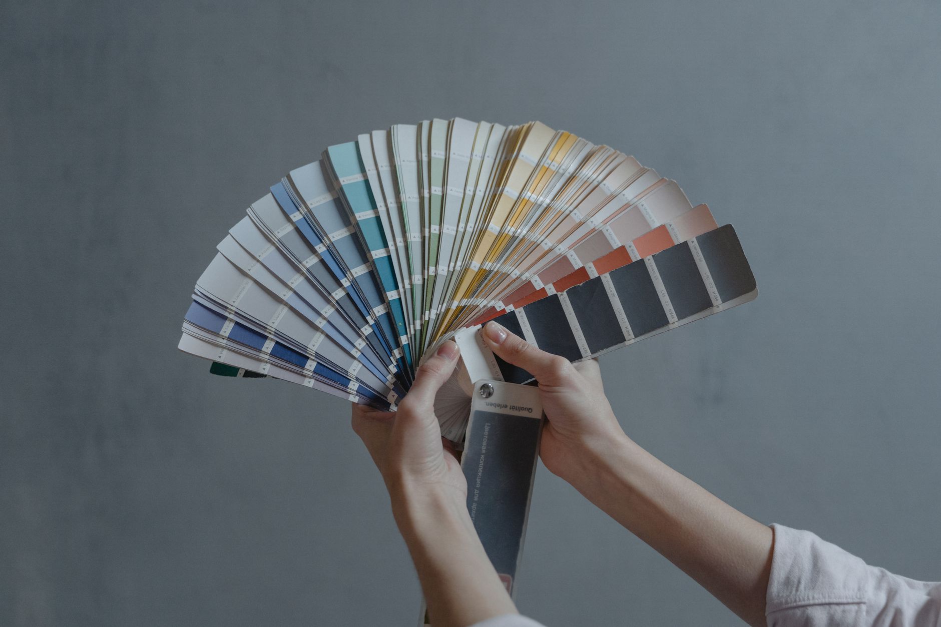
TL;DR: Color psychology in DTC brand design means choosing palette, contrast ratios, and color hierarchy based on what your target buyer associates with trust, value, or desire — not based on what the founder likes. In 2026, the brands winning on paid social and organic search use color as a strategic signal, not a stylistic one. This guide walks you through the exact steps to apply it: from audit to palette selection to execution across paid ads and packaging.
Why this matters
A buyer on a DTC product page makes a visual judgment in under 90 milliseconds, according to studies cited in the Journal of Business Research. Color accounts for roughly 62–90% of that first impression by some aggregated estimates. On Meta ads in 2026, where thumb-stop rate determines whether your creative even gets seen, the wrong color palette can tank a campaign before copy, offer, or hook have any chance to work. This is not a branding exercise — it's a performance lever.
What you'll need
- A written positioning statement for your brand (who you serve, what you stand for, the one emotional territory you own)
- 5–10 competitor brand screenshots from their site, packaging, and paid ads
- Access to your current brand assets (logo files, existing color hex codes)
- A color contrast checker (WebAIM's tool is free and accurate)
- 60–90 minutes for the audit phase; another 2–3 hours for palette development
- A creative brief template if you're briefing a designer or agency after this process
The steps
Step 1: Audit your competitive color landscape
What it accomplishes: You cannot differentiate by color until you know what colors your category has already claimed.
Screenshot the hero section of every major competitor's site and their 3 most-run Meta ad creatives (use the Meta Ad Library, which is free and public). Map each brand to its dominant hue. In most DTC categories, you will find clustering — beauty brands cluster around blush and black, supplement brands cluster around blue and white, food brands cluster around warm earth tones.
The goal is to find the open lane, not to pick your favorite color. If every brand in your category uses navy and white to signal "clinical trust," a challenger brand using terracotta and cream has a visual differentiation advantage before a single word is read.
Common mistake: Auditing only websites and ignoring Meta ad creative. Paid social colors and site colors often differ, and the ad is where most buyers will encounter your brand first in 2026.
Step 2: Map your positioning to an emotional territory
What it accomplishes: Connects your brand strategy to the psychological associations that colors carry, so the palette is an argument, not an aesthetic.
Start with your positioning statement. Identify the primary emotion you want a buyer to feel in the first 3 seconds of seeing your brand. Every emotional territory maps to a color family with documented associations:
- Trust and authority: Navy, deep blue, white. Used by brands that need credibility before desire.
- Energy and urgency: Red, orange, high-contrast yellow. Drives impulse; performs well in CPG and fitness.
- Calm and wellness: Sage, muted teal, warm off-white. Signals safety and self-care; dominant in supplements and personal care.
- Luxury and exclusivity: Black, deep plum, gold. Raises perceived price point; requires disciplined restraint in use.
- Natural and sustainable: Earthy greens, unbleached cream, terracotta. Signals ingredient transparency and environmental values.
- Playfulness and community: Bright primaries, electric pastels. Works in kids, food, and lifestyle DTC where joy is the value prop.
Pick one primary emotional territory and one secondary. The mistake brands make in 2026 is trying to own three territories simultaneously — the result reads as no territory at all.
Common mistake: Choosing an emotional territory that contradicts your price point. A $9 product in luxury-signal black confuses the buyer. A $180 product in bargain-signal neon orange destroys perceived value before checkout.
Step 3: Select your working palette — primary, secondary, accent
What it accomplishes: Gives your creative team a constrained system they can execute consistently across 20 different ad formats, a website, and packaging without making ad-hoc color decisions.
A DTC brand palette needs exactly three layers:
- Primary color — the dominant hue that appears in 60–70% of any given asset. This is your brand's visual shorthand. It should be the most immediately associated with your emotional territory.
- Secondary color — used in 20–30% of the asset, typically for backgrounds, secondary text blocks, or product photography surfaces. It complements the primary without competing.
- Accent color — used sparingly (5–10%) for CTAs, price callouts, and conversion-critical elements. The accent should have the highest contrast ratio against both the primary and secondary. On paid social in 2026, the CTA button color is a performance variable, not a design preference.
Test your primary color in the Meta Ad Library against actual thumb-scroll behavior. If your dominant color is the same mid-blue as three other brands running ads in your category, you will blend into the feed regardless of how strong your copy is.
Common mistake: Choosing an accent color that matches the primary. A red CTA button on a red background has near-zero contrast and will visually disappear on mobile screens, which account for the majority of DTC paid social traffic.
Step 4: Define color rules for each channel context
What it accomplishes: Prevents the palette from fragmenting as it gets applied across different surfaces with different rendering environments.
The same hex code looks different on a mobile OLED screen, a desktop monitor, a printed package, and a physical shelf. Define explicit rules for each context:
- Paid social (Meta, TikTok): Prioritize the first 1–2 seconds of the creative. The primary color should be visible in the first frame of any video or in the hero zone of any static. Test dark-background versus light-background variants — aggregated DTC data from 2026 shows dark-background creatives outperform in fitness and beauty; light-background outperforms in food and home goods, but this reverses by category and audience.
- Packaging: Colors shift significantly in print. Get physical proofs, not just digital mockups. Matte finishes desaturate; gloss finishes saturate. Your "sage green" brand color on a screen may print as "army green" without a Pantone reference.
- Email and landing pages: Use the secondary color as the dominant background to give the eye a rest from the primary. Reserve the accent for the single most important CTA on the page.
- Organic social: Allow more flexibility in color use, but ensure the primary color appears in your profile image and story highlights so your brand is recognizable in the grid.
Common mistake: Briefing designers with hex codes but no context rules. A designer will apply the palette correctly in isolation and incorrectly at scale if they don't know which color leads in which context.
Step 5: Build a color brief and run a contrast audit
What it accomplishes: Produces a reusable document that makes every future creative decision faster and consistent, whether your team is in-house, freelance, or agency.
The color brief has four sections:
- Palette specification: Hex, RGB, CMYK, and Pantone reference for each of the three palette layers.
- Usage ratios: Exact percentage rules (60/30/10 or your defined split) so any designer can reconstruct the system without guessing.
- Prohibited combinations: List the specific color pairings that are off-limits — usually two high-saturation colors at equal weight, which creates visual vibration and looks cheap.
- Contrast audit results: Run every text-on-background combination through WebAIM's contrast checker. WCAG AA standard requires a 4.5:1 contrast ratio for body text. Failing this on a product page or ad is both an accessibility issue and a conversion issue — low contrast text on mobile screens is unreadable at arm's length.
Share the brief with every creative vendor before work starts. This eliminates the most common source of brand inconsistency in DTC brands that work with multiple creative partners simultaneously.
Common mistake: Treating the color brief as a one-time deliverable. Revisit it every time you enter a new channel, launch a new product line, or run a seasonal campaign that introduces temporary color variations. See the develop packaging creative that supports brand positioning guide for how this applies specifically to physical product surfaces.
Step 6: Test color decisions as creative variables, not brand constants
What it accomplishes: Separates the brand's permanent color identity from the tactical color decisions that should be tested and optimized on paid channels.
Your brand's primary color is not a test variable — it's a constant. But your CTA color, background color in ad creative, and thumbnail color in video are all variables you can and should test. In 2026, the fastest way to improve paid social performance without changing your offer is to run a background color test: same copy, same creative concept, two background colors.
Run each variant for a minimum of 1,000 impressions per ad set before drawing conclusions. One color will produce a higher thumb-stop rate; the other may produce a higher click-through rate. These can be different colors — the color that stops the scroll is not always the color that converts. Knowing this split informs your full-funnel creative strategy: awareness-stage creative uses the high-thumb-stop color; conversion-stage creative uses the high-CTR color.
Common mistake: Changing the primary brand color because a test variant outperformed. An accent or background test result does not mean your brand color is wrong — it means a specific tactic within that context performs better.
Troubleshooting
Your color palette tests consistently below benchmark on paid social.
The problem is usually contrast, not the hue itself. Run every static creative through a contrast checker at the actual mobile screen size (375px wide). If the product or text gets lost against the background, increase the contrast ratio before testing new colors.
Your packaging color and your digital color look like two different brands.
You are missing a Pantone bridge. Get the Pantone closest-match reference for your primary hex color and brief all print vendors with that reference, not the hex. The hex is for screens; Pantone is for physical production.
Customers describe your brand as generic or forgettable despite strong copy.
You are probably using a palette that is identical or near-identical to two or more category competitors. Return to Step 1 and re-audit. If your primary color clusters with competitors, you need to either shift the hue enough to be distinct or shift the secondary color to create a signature combination.
Your color system breaks when a seasonal campaign requires a limited-edition palette.
You need a seasonal color protocol: define which palette element can flex (usually the secondary or background) and which cannot (the primary and accent). The primary color must remain constant so brand recognition transfers from evergreen to seasonal creative.
Designers on different projects keep making ad-hoc color decisions.
The color brief is not being used or does not exist yet. Step 5 is not optional. Add the color brief to your standard creative brief template so it accompanies every project automatically. The creative brief for a brand campaign guide covers how to structure the full brief document.
Your brand color works on Instagram but looks wrong on TikTok.
TikTok's default feed background is black; Instagram's is white. A light-primary-color brand will visually disappear on TikTok without a dark frame or background element. Create a channel-specific color rule that adds a dark surround to any creative intended for TikTok.
Tools and resources
- WebAIM Contrast Checker — free, browser-based, gives exact contrast ratios for any hex pair
- Meta Ad Library — free competitive color audit for paid social; search any competitor brand
- Coolors.co — palette builder with Pantone export; useful for building the 60/30/10 system
- Adobe Color — lets you test palette accessibility and color harmony rules simultaneously
- Your positioning statement — the single most important input; without it, color choices are arbitrary
- Develop a visual identity for a DTC product brand — covers the broader identity system that the color palette lives inside
What to do next
Color is one input into a full brand identity. Once your palette is defined and tested, the next decision is how that identity system gets expressed in paid creative — specifically, how to translate a brand positioning strategy into ad formats that convert. The brand positioning into paid ad creative guide covers exactly that transition, starting from the positioning document and ending with a production-ready creative brief.
Questions we are
often asked.
The questions founders ask most often about this topic — answered straight.
Ask a question →01What is color psychology in DTC brand design?
02How many colors should a DTC brand use?
03Does color actually affect conversion rates for DTC brands?
04What colors work best for DTC health and wellness brands in 2026?
05How is color psychology different for paid social versus packaging?
06Should a DTC brand change its primary color if a competitor uses the same one?
07How do I know if my current brand colors are hurting performance?
08Can a DTC startup pick brand colors before they have real customer data?
We work with a small number of brands each year.
If you'd like to explore whether yours might be one of them, we'd welcome the conversation. There is no deck, no SDR, and no obligation on either side.